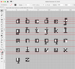
Build a font or Invade Russia During Winter?

Your latest picture book work is done.
Your agent is at the Bologna Book Festival promoting your stuff.
You’ve finished all but one of your Cadburys Creme Eggs, and you’re idly browsing fonts on www.dafont.com.
“That looks easy! I can do that,” you think. After all, building a font is simple: You come up with a few basic rules/guides to follow (e.g. serif, futuristic, fixed width etc…) and then start playing around. Naturally, within a day or two, you’ll have a nifty typeface of your very own that people can download and use all over the world.
Two weeks later, you find yourself crying over your keyboard, swearing at the ascender of your lower case F, asking why it won’t play nicely with all the other letters, like your well behaved little Bs, Cs and Ss.
Apparently, Napoleon developed his own font, too – a form of Braille, created from simple principles that enabled messages to be read in the dead of night. There aren’t any historical sources I can locate that write about how flippin’ hard he found the whole thing, but given my own experience I can see why he chose invading Russia as his next venture. It’s a piece of cake compared to creating your own alphabet.
And yet… And yet… the reason I won’t be throwing my laptop out of the window and burning effigies of Adobe Illustrator any time soon is because building a font is so damned fun.
Yes, it is challenging and infuriating, but it’s also like a Rubik’s Cube that’s 80% complete: puzzling, beautiful and playful all at the same time. So I’m going to see this one out – whether it takes a week or a month. And at the end of it, I’ll probaly need a name for my font, too.
Currently Napoleon’s Rubik’s Cube is winning that one.


0 Comments